This blog is the first in a four-part series sharing key takeaways from Making Tax Analyses More Effective and Inclusive: A Guide For Analysts.
Taxes affect people’s daily lives even when they may not realize it. Beyond paying for public goods and services like schools and roads, they influence decisions about housing, childcare, health insurance, and retirement. Yet many people find the tax system hard to understand, making it difficult for them to engage in public debates that shape their lives and communities.
Many organizations work to make taxes more understandable by analyzing policies or proposals and explaining their effects in plain language. Building on the work of government scorekeepers, they often produce distributional tables, such as here or here, showing how a tax change would affect different groups of people by income, age, or other demographics. Researchers, journalists, and policymakers regularly rely on these tables as a shared reference point.
But distributional tables paint a big, complex picture. They sum up estimates over whole groups and may leave people curious about how they will personally experience a policy change. As a result, tax analysis can still feel distant or overly technical to many audiences.
Clear language and user-friendly visualizations can help bridge that gap. Our new guide outlines practical ways that tax analysts can build more straightforward and engaging products. Drawing on conversations with data users and a review of data visualization best practices, we identify three overarching strategies.
Anchor tax policy to real-world outcomes
Tax analysis is more likely to resonate with people when anchored to the outcomes they care about, especially those that impact their daily lives. Analysts can look beyond technical concepts like “percentage change in after-tax income” or “total tax change amount” and also highlight how a policy affects a household’s ability to pay for everyday needs such as rent, a mortgage, groceries, transportation, or childcare.
For example, past Urban research on Baby Bonds estimates estimated effects on eligible families’ net wealth and translates those amounts into what they could mean for families with student loans, homeowners, and those saving for retirement. Providing concrete dollar amounts and linking them to familiar financial pressures makes it easier for people to understand the magnitudes of effects of policies and weigh their impacts.
Help readers visualize a tax story
Even the most uncomplicated table can feel intimidating or inaccessible to audiences who do not regularly work with tax data. Adding visual elements to distributional tables or transforming tables into graphics, narratives, or interactive tools, can broaden engagement and clarity.
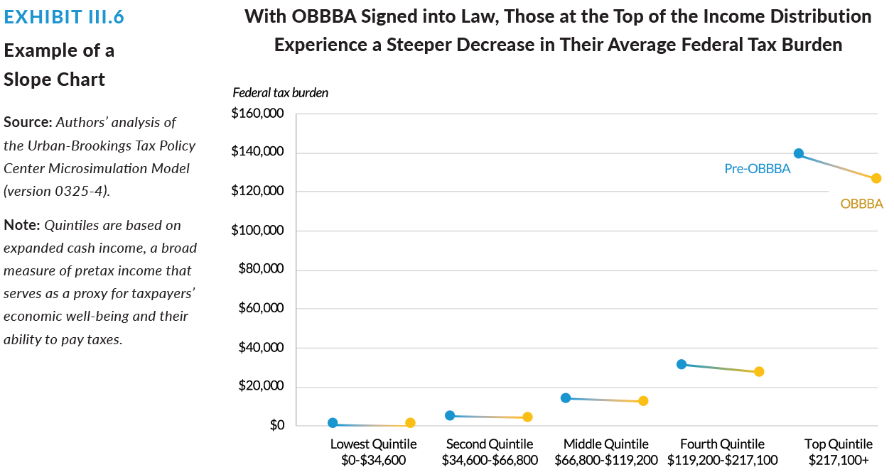
Graphs can help turn complex distributional data into intuitive snapshots. This figure about the One Big Beautiful Bill Act compares the before and after of a policy, just like a distribution table does. But it demonstrates impact by using individual “slopes” to illustrate both levels and changes between groups. It also displays income amounts that a user can easily track, and it shares the bottom line of the analysis in its title.
Storytelling can also help show how a policy affects different kinds of families. A recent TPC feature tells illustrated stories of five fictional families and the barriers they each face in filing taxes and claiming federal tax benefits. The stories convey how the tax system can better support all families.
Use clear, direct language and framing
Good tax analysis depends not only on its content, but also on its communication style. Plain language helps ensure that both newcomers and more experienced readers can understand and care about tax analysis.
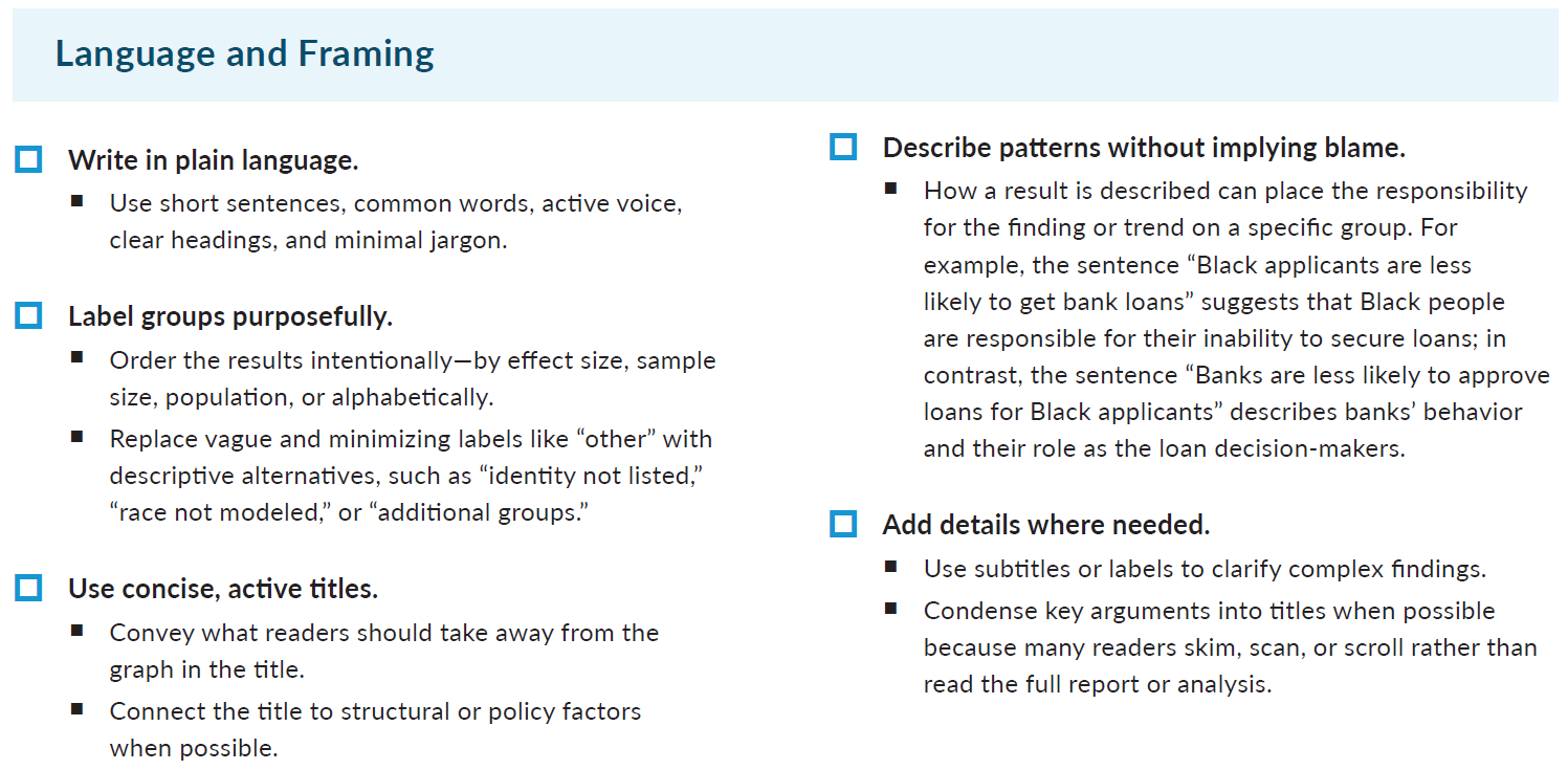
Our guide includes checklists, such as below, to help tax analysts make complicated concepts simpler and more inviting. They outline steps to make language and framing simpler, data visualizations and graphic designs more engaging, and final design of products more accessible. Some of the strategies include writing jargon-free explanations, choosing language carefully to avoid stigma, and using explanatory titles.
These techniques ensure that tax research does more than convey facts—it can invite understanding and encourage informed participation from wider audiences, including advocates, non-profit stakeholders, and the people they serve.
Clearer, more engaging tax analyses can help more people see how policy affects their lives and empower them to participate in policy debates that shape their futures.